Nuro
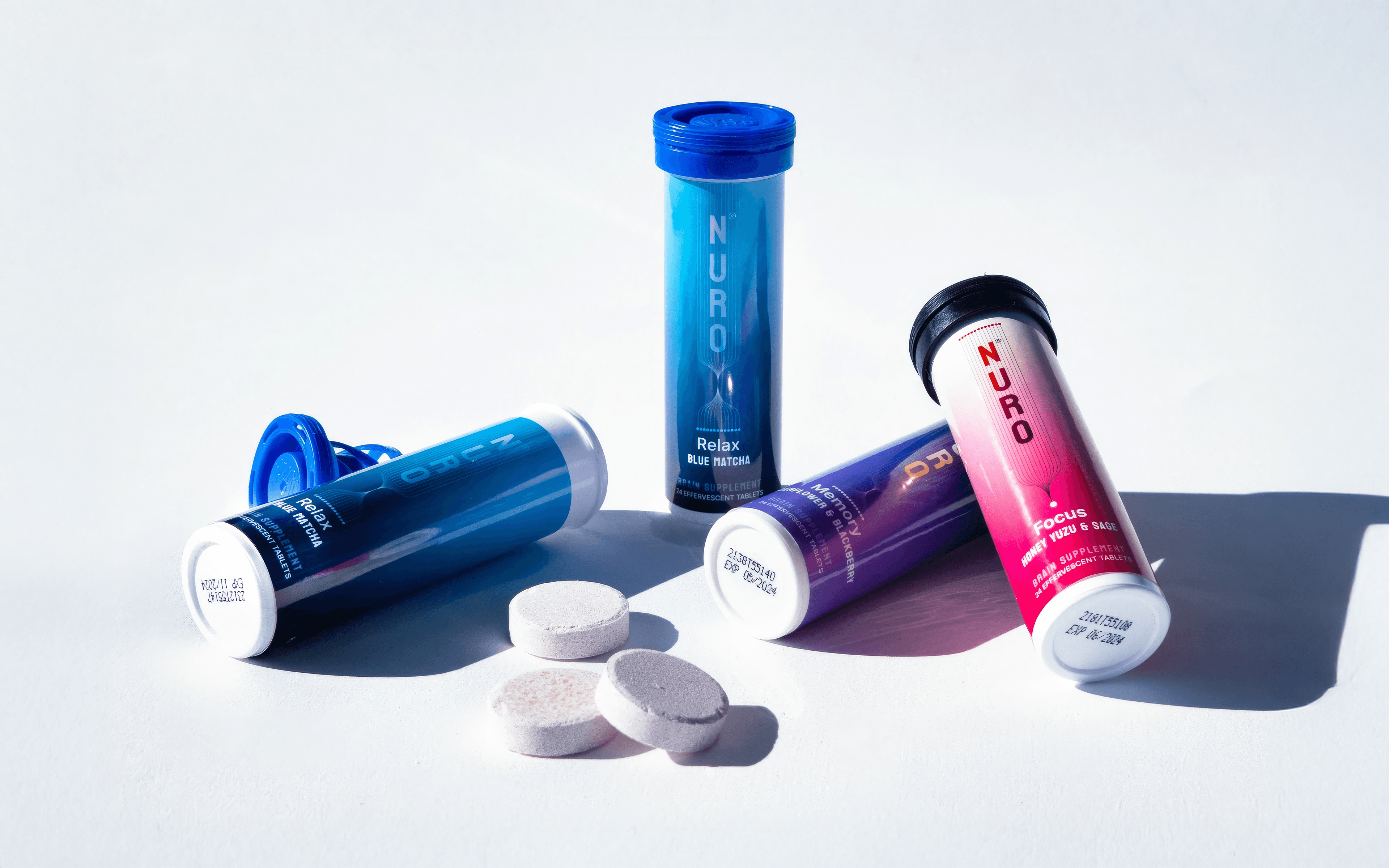
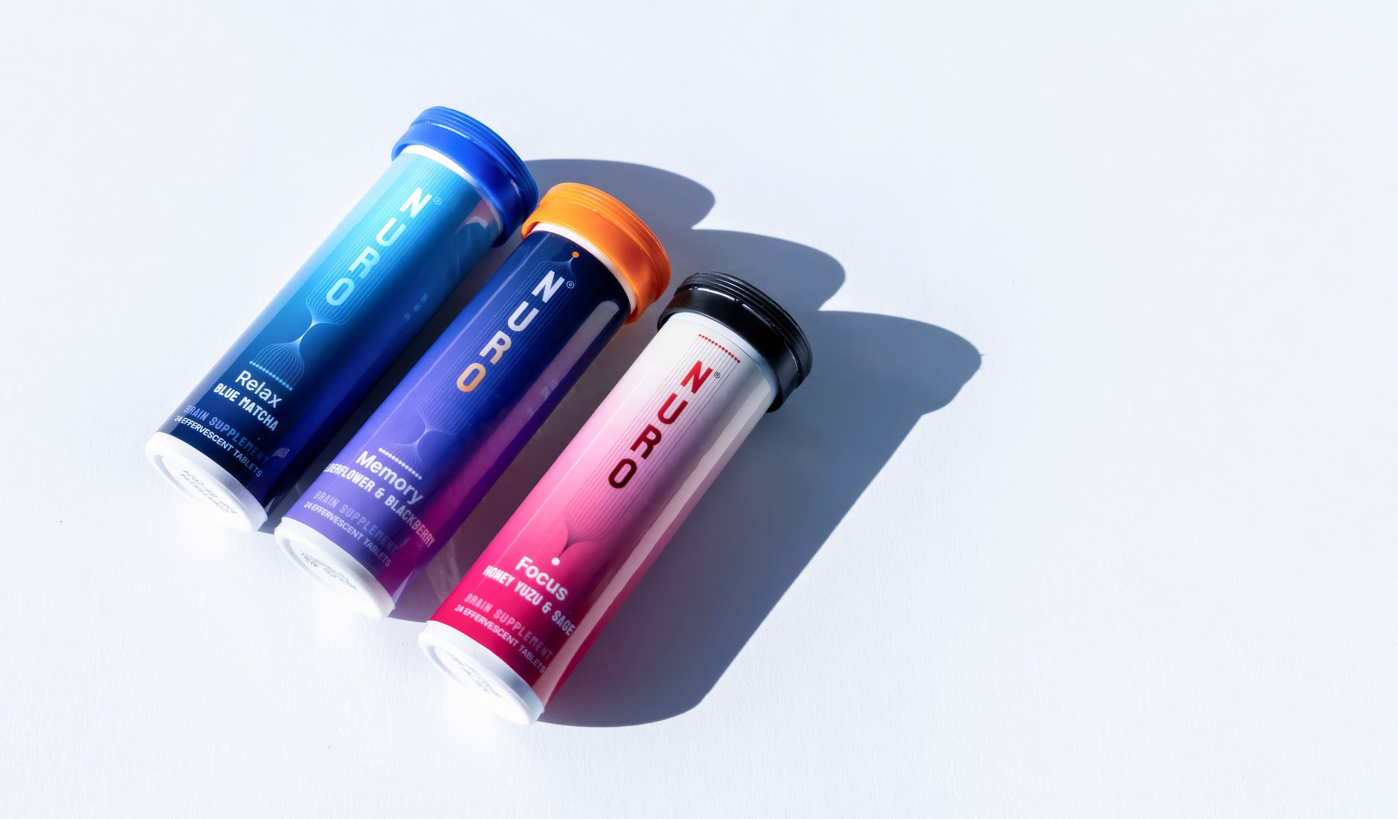
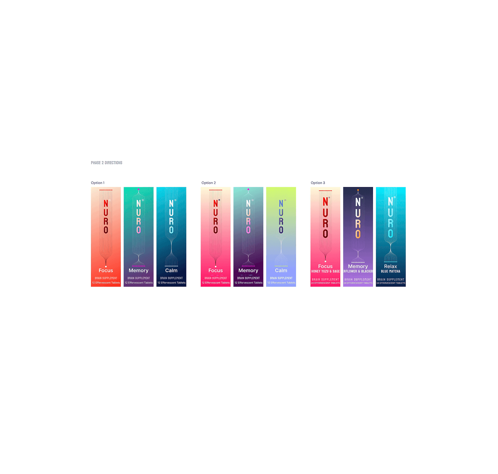
A brain-boosting supplement, designed with the brain in mind. We built NURO from the ground up, creating a visual identity and packaging system that matches the product’s core promise: clarity, calm, and cognition—anywhere, anytime. NURO’s tube format and vibrant flavor system needed a brand that stood out both on shelves and in minds. Our design language bridges science and simplicity: delicate linework, gradient color shifts, and a vertically stacked logo echoing the structure of neural pathways.
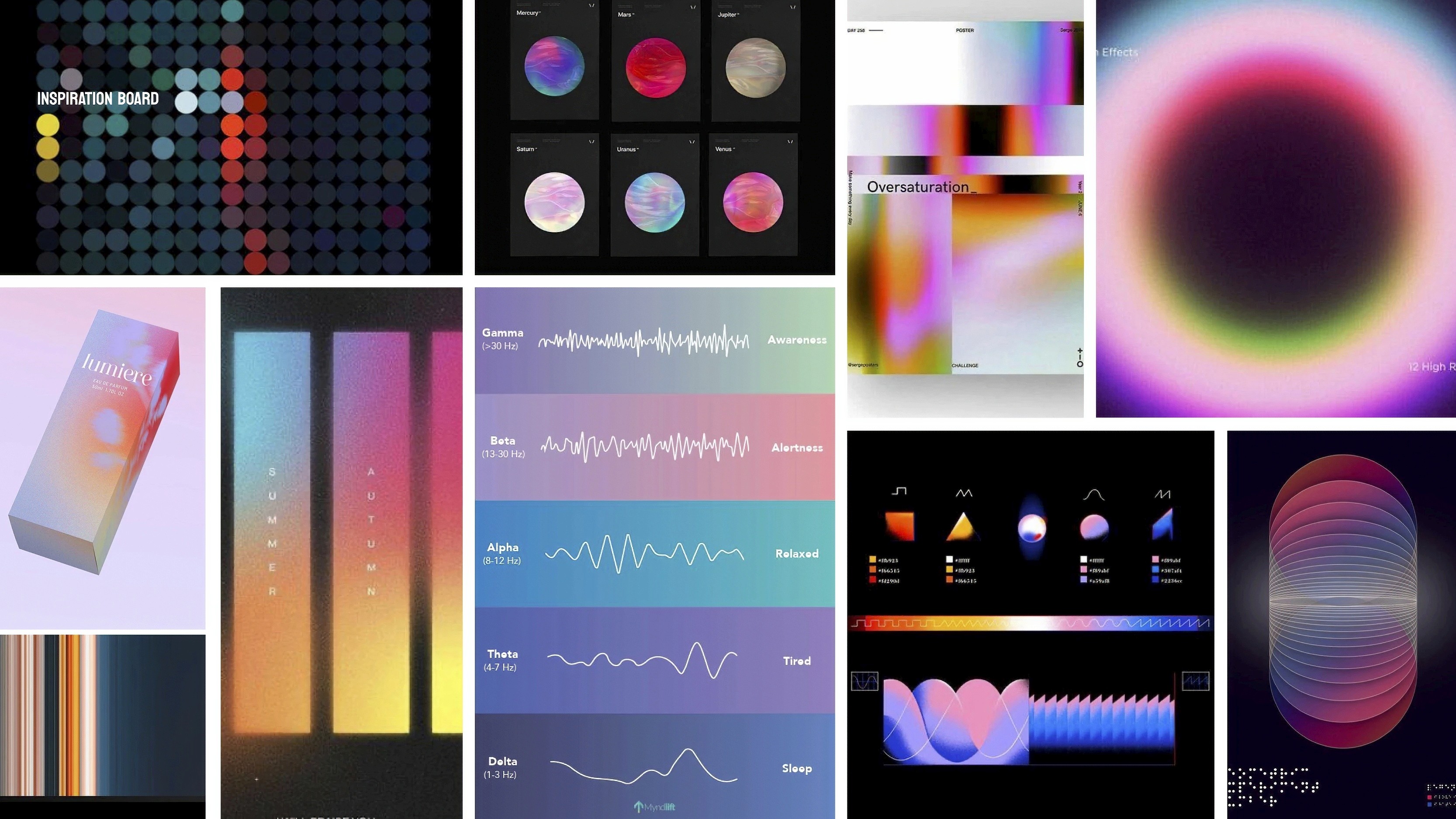
From strategy to shelf, this project included full brand positioning, identity design, material testing, packaging production, and art direction. Inspired by EEG waveforms and MRI scans, every design decision was grounded in cognitive symbolism—translating the invisible complexity of the brain into something you can hold in your hand. NURO isn’t just smart on the inside—it looks it too.
Client:
Nuro
Date:
2024
Role:
Strategy
Strategy
Branding
Branding
Packaging
Packaging
A brain-boosting supplement, designed with the brain in mind. We built NURO from the ground up, creating a visual identity and packaging system that matches the product’s core promise: clarity, calm, and cognition—anywhere, anytime. NURO’s tube format and vibrant flavor system needed a brand that stood out both on shelves and in minds. Our design language bridges science and simplicity: delicate linework, gradient color shifts, and a vertically stacked logo echoing the structure of neural pathways.
From strategy to shelf, this project included full brand positioning, identity design, material testing, packaging production, and art direction. Inspired by EEG waveforms and MRI scans, every design decision was grounded in cognitive symbolism—translating the invisible complexity of the brain into something you can hold in your hand. NURO isn’t just smart on the inside—it looks it too.

© 2025 Sucks Design
Twitter.
Instagram.
Linkedin.